
mySalesman Case Study
Product
Lead Qualification Tool | B2B, SaaS
Sector
Construction Technology, Sales Enablement Software, Home Improvement
My Role
- Workshop Facilitation
- Research
- Information Architecture
- Voice & Tone
- UI Design
My Team
- Principal Engineer
- Senior Software Engineer
- Project Manager
- Product Designer (myself)
- Developers
- Quality Assurance
Main Goal
Help make contractor sales easy with qualified leads.
About
mySalesman helps fencing and roofing companies save time by qualifying leads before they ever step onsite. Used by hundreds of companies worldwide, it simplifies quoting, increases efficiency of lead generation, and connects contractors with customers who are ready to buy.
The Challenge
mySalesman approached the team facing a pivotal moment: their legacy platform needed to be migrated to a new codebase in just 8 weeks. This was not simply a technical upgrade; it was also the first real opportunity to address long-standing pain points that had been dormant for years due to business and financial constraints outside of the team’s control.
Contractors felt limited by the lack of scalability in the solution. At the time, the platform primarily supported fencing, but contractors wanted the flexibility to expand into services like roofing, turf, and power washing. This constrained their ability to grow within the system. Meanwhile, homeowners struggled with confusing workflows and a lack of transparency around pricing, which often led to frustration and abandoned quotes. These issues had lingered in the background, but the migration introduced pressure to resolve at least some of them while ensuring a smooth transition for existing users.
The stakes were high as the platform was already trusted by hundreds of companies, so adoption risk had to be minimized. At the same time, leadership wanted to evolve the product to support additional service lines, scale more effectively, and strengthen customer loyalty in a competitive market.
My challenge was to design improvements that would:
- Streamline quoting without alienating existing users
- Reduce wasted time for contractors by improving lead quality
- Deliver a faster, clearer experience for homeowners exploring options
- Stay within the strict budget and timeline constraints of the migration
This balance of constraints, dormant frustrations, and business goals shaped every design decision moving forward.
The Approach
First, my team and I began building a product strategy by defining the levels of success:
- Impacts: What broader, long-term difference will we make?
- Outcomes: What changes will users or the business experience as a result of our work?
- Outputs: What tangible deliverables will we create?
Next, we collaborated on applying IDEO’s Desirability, Viability, and Feasibility (DVF) framework to shape guiding key questions:
- Desirability: Will people use the product, and why?
- Viability: What is the business value of the product?
- Feasibility: Is the product technically possible to create?
While the team contributed across all three areas, my main focus was desirability, where I generated many of the guiding questions with our two core personas in mind: contractors (mySalesman’s direct customers) and homeowners (end users). The specific questions I explored included:
- What experiences should feel new and more intuitive compared to the legacy system?
- How can we redesign familiar features without disrupting current users?
- Which aspects of the quote creation process can be streamlined to deliver faster estimates to homeowners?
The Discovery
Once we delivered the product strategy proposal and received the green light from the client to begin work, I began some of my initial key question activities around the discovery process to better frame the problems to be solved and collect evidence on how to execute on a path forward.
Legacy System Content Audit
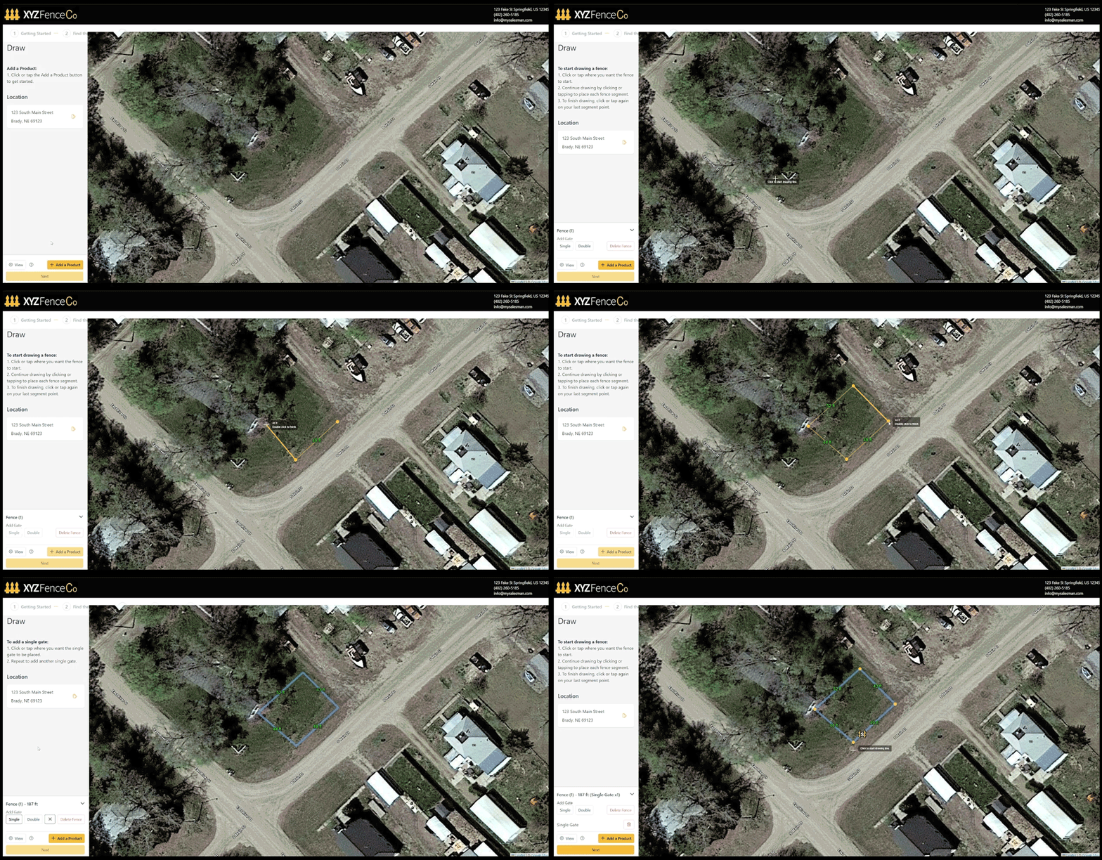
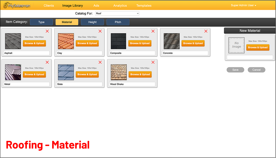
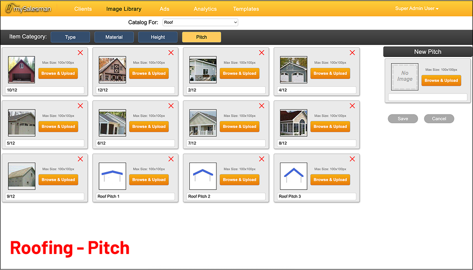
Before starting any design, I needed to better understand the existing mySalesman legacy software and uncover gaps where improvements were needed. I conducted a content audit cataloging all available pages, features, and information. This included capturing screenshots of the old system and carefully labeling each element. I then shared the audit with my team, creating a space for them to leave comments and ideas. Together with the mySalesman team, we used RICE scoring to determine which elements were essential for the go-live date. Having a clear reference of the old system was invaluable for grounding conversations and sparking divergent ideas for the new platform. At the same time, I ensured the audit served as a guide rather than a blueprint, helping us reimagine the product without being anchored to outdated designs.
Improvements prioritized for migration included:
- Streamlined quote creation process with boundary mapping first.
- Centralized pricing catalog to reduce duplication.
- Simplified admin dashboards for lead visibility and status.
- Cleaner homeowner → contractor handoff to reduce drop-offs
Gathering User Insights
Direct end-user interviews weren’t feasible within the scope of the project, but I tapped into the sale’s team insights gathered from industry conferences and direct communication with their customers everyday. This helped support anecdotes about homeowner confusion and abandoned quotes and ensured the contractor’s voice still guided design decisions. If the timeline had allowed for direct user testing, I would have prioritized validating several critical assumptions.
For contractors, I would have tested whether the new catalog and pricing tools reduced the effort needed to manage diverse service lines like roofing, turf, and power washing.
For homeowners, I would have explored whether the restructured quote workflow, with boundary mapping first and contact information last, reduced drop-offs and improved clarity around pricing. Usability sessions would have also revealed how well the mobile-first design supported quick completion on small screens, since mobile was the dominant entry point for most homeowners. These insights would have provided additional confidence in the redesign while highlighting areas for iterative improvement after launch.
Understanding User Goals, Motivations, and Pain Points
It was important to understand the needs of both contractors and homeowners, since the platform’s value depended on serving both sides of the interaction equally well. Contractors were primarily focused on capturing qualified leads and reducing wasted effort on non-serious prospects, while homeowners sought quick, transparent quotes to make confident decisions. Both groups were motivated by saving time, reducing stress, and presenting themselves or their projects in the best light, but they faced challenges with the legacy system’s complexity, lack of scalability, and limited transparency. These insights helped shape a solution that balanced efficiency for contractors with empowerment and clarity for homeowners.
Contractor Goals
- Capture more qualified leads without wasting time on non-serious prospects
- Focus sales efforts on jobs that are more likely to convert
Contractor Motivations
- Save time and money on sales visits that don’t pan out
- Present a professional, tech-forward image to homeowners
- Reduce frustration from sorting through “junk” leads
Contractor Pain Points
- Homeowners dropping off when the process felt too complex
- Limitations of the legacy system’s scalability of product offerings (i.e. power washing, turf, etc.)
Homeowner Goals
- Obtaining a speedy fence or roof quote cost before committing
- Explore different materials and options to fit within budget and preferences
Homeowner Motivations
- Get a sense of pricing before deciding to make a purchase
- Feel empowered in making choices
- Reduce stress of managing a home improvement project
Homeowner Pain Points
- Difficulty using legacy system to select a highly customized product
- No transparency into pricing while selecting materials and options
Competitor Analysis
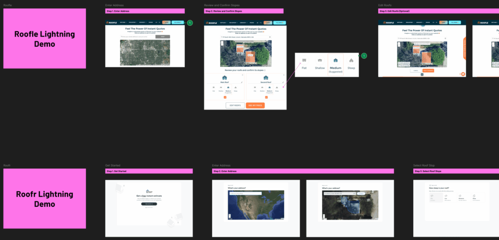
To ensure the redesign was not only solving legacy pain points but also competitive in the broader construction tech space, I reviewed roofing software products like Roofle, Roofr, and EagleView. These tools had gained traction in adjacent markets, and analyzing them helped me understand how contractors and homeowners were already experiencing digital quoting solutions outside of mySalesman.
I mapped their features and workflows against our core user needs, which highlighted both best practices to adopt and pitfalls to avoid.
Key takeaways from competitors included:
- Boundary mapping should happen first, since it defines the core quote process.
Customer contact info should come last to reduce friction and drop-offs in creating a quote. - API integrations (e.g., satellite data) could fast-track boundary creation, but manual drawing was necessary as a fallback.
What I did differently as a result:
- Instead of copying competitor workflows directly, I prioritized flexibility. Our design allowed for both automated boundary mapping (via integrations) and a guided manual workflow, ensuring homeowners with non-standard properties were not left behind.
- I restructured the quoting flow to place project setup first (boundary, materials, and pricing) and move personal details last. This was not just a best practice, it was a way to reduce the “sales-first” feel that had been frustrating homeowners.
- I translated learnings into admin-facing tools (pricing and product catalogs), which competitors often overlooked. This gave contractors scalability across multiple service lines, a differentiator that addressed one of mySalesman’s biggest legacy limitations.
The Definition
In the definition phase, I translated the discovery insights into a clear design direction. This involved prioritizing the most important data, aligning on the goals of both contractors and homeowners, and establishing the foundation for how the platform would be structured and communicated. The goal was to create a focused blueprint that kept the team aligned and ensured the design stayed grounded in user and business needs.
Voice & Tone Communication Strategy
In a workshop with mySalesman leadership, we defined brand voice pillars and tailored tone by our audience:
- Contractors (customers): Clear, direct, efficiency-driven.
- Homeowners (end users): Friendly, approachable, reassuring.
I embedded this strategy into microcopy across the product, including 404/500 pages, call-to-action buttons, error messages, and more.
Information Architecture
For the mySalesman redesign, I focused on creating a clear, intuitive information architecture that would support both homeowners and contractors as they moved through the quoting process. The legacy system had grown organically over time, with content and features scattered across screens in ways that often confused users. My role was to bring order and clarity to this experience.
The results from the content audit and RICE scoring activity was a streamlined site map and hierarchy that grouped content by user intent rather than internal business logic. For example:
- Contractors could more easily prioritize their most sold materials in a way that displayed first for homeowners
- Homeowners could now see better organized materials and options around project setup, including real-time updated visuals and pricing
Throughout the process, I was careful not to replicate the shortcomings of the old system. The legacy architecture served as a useful reference, but I designed the new structure from the ground up, focusing on clarity, consistency, and scalability. This IA work laid the foundation for smoother navigation, more predictable user flows, and a platform that could evolve and scale for multiple product line offerings without collapsing under the weight of ad-hoc features.
The Design
In the design phase, I translated strategy into execution by creating wireframes, mockups, and design system components that brought the platform to life. My focus was on streamlining the quote creation process for homeowners, improving lead quality for contractors, and building scalable admin tools to support long-term growth.
Solutions Designed
I redesigned the mySalesman platform to address specific frustrations from both contractors and homeowners. Each design choice was tied directly to a pain point uncovered in the discovery phase.
Homeowner-Facing Solutions
- Problem: Homeowners struggled with confusing workflows and abandoned quotes due to unclear pricing and a lack of transparency.
- Design: I created a guided, mobile-first quote workflow that began with boundary mapping. This ensured every estimate started with accurate context. Homeowners could then explore materials with real-time pricing updates and see the impact of their choices instantly. Contact information was collected at the end to reduce friction and drop-offs.
- Impact: The workflow gave homeowners a clear, approachable experience that built confidence in their decisions and increased the likelihood of completing a quote.
Contractor-Facing Solutions
- Problem: Contractors were limited by a fencing-only system that lacked scalability and required manual effort to manage pricing and services.
- Design: I introduced two core tools:
- Admin Catalog: A centralized place to manage products and material details across multiple service lines such as roofing, turf, and power washing.
- Pricing Catalog: A rules-based pricing system where contractors could set calculations once and apply them consistently across all offerings.
- Impact: Contractors could scale their businesses more easily, reduce duplicated work, and spend less time managing manual adjustments, freeing them to focus on qualified leads.
My Design Process
I began with low-fidelity wireframes that focused purely on the core functionality of the product. I often described these to clients as the “bones” of the design, stripped of branding, color, or imagery so conversations and feedback stayed centered on usability and workflow rather than visual styling. Because the majority of homeowners accessed mySalesman on mobile devices, I approached the project with a mobile-first mindset, ensuring layouts and interactions were intuitive and accessible on smaller screens before scaling up to desktop.
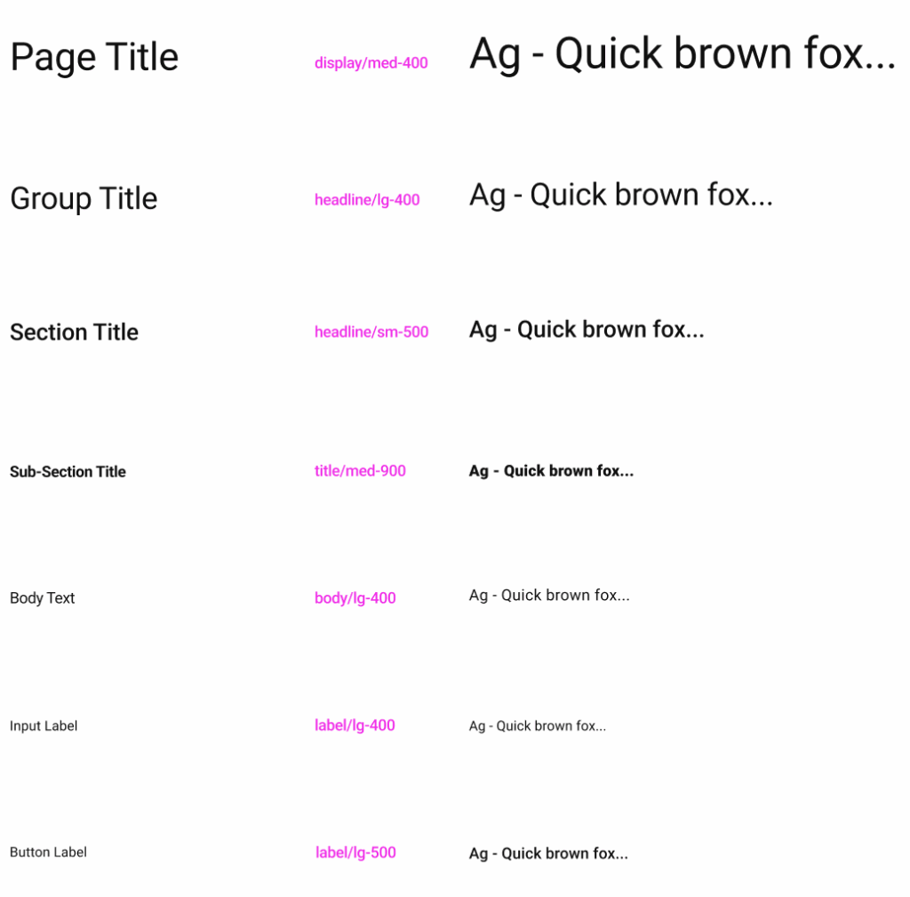
Throughout the process, I met weekly with the mySalesman team to review progress, gather feedback, and make iterative adjustments. In parallel, I collaborated with another designer to build a design system in Figma based on Angular PrimeNG. This provided a single source of truth for components, enabling faster design iterations and smoother developer handoff. Once feature sets were validated in low fidelity, I transitioned them into high-fidelity mockups using the design system, delivering polished screens ready for implementation.
The Delivery
The redesigned platform was prepared for handoff to development with a clear focus on usability, scalability, and alignment with contractor and homeowner needs. My role during delivery emphasized creating design documentation, detailed workflows, and interactive prototypes that served as a single source of truth for the engineering team. I worked closely with stakeholders to ensure the solution balanced immediate business priorities for launch with flexibility for future feature growth. Even though I was laid off before the full release, my design delivery provided a solid foundation for development, ensuring the team could move forward with clarity and confidence.
Performance Evaluation & Metrics
Because I was laid off before the project reached full development release, I didn’t have the opportunity to observe real-world outcomes. However, if I had continued on the project, I would have focused on defining and tracking metrics that tied directly to both user needs and business goals. Specifically, I would have measured:
- Time on Task: How quickly homeowners could complete property boundary mapping compared to the legacy system. Faster completion would validate the streamlined, mobile-first workflow.
- Conversion Rates: The percentage of quotes that converted into qualified leads. The goal would have been to reduce “tire-kicker” submissions and improve contractor efficiency.
- User Satisfaction: Contractor feedback on lead quality and homeowner feedback on ease of use, confirming whether the design delivered clarity and efficiency to both audiences.
I also would have recommended setting up analytics to monitor drop-off points in the quoting process, paired with periodic surveys to capture qualitative feedback. Together, these measures would have created a strong framework for evaluating design impact and guiding iterative improvements post-launch.
You can try out the live (free) demo of mySalesman here!